HIGH STREET clothing retailer Gap has scrapped plans to replace its iconic logo with a new design, after designers and fans alike decried the proposed new design in their tens of thousands.
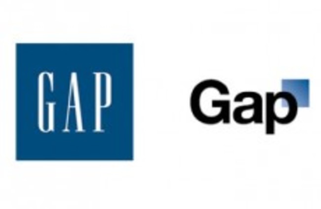
The company last week unveiled plans to replace its iconic blue square with elongated serif lettering with a plainer logo, using the ubiquitous Helvetica typeface and featuring a bizarre, inexplicable semi-transparent lighter blue box.
The plans prompted a flurry of angry on both Twitter and Facebook – where the Guardian reports that over 2,000 negative comments were left on Gap’s page complaining about the scrapping of the older brand – while the internet’s ultimate condemnation, a parody, appeared on Twitter with a @gaplogo account (tweeting the “thoughts” of the now-abandoned design) accruing almost 5,000 followers.
Another parody site created in response to the rebranding – Make Your Own Gap Logo – has seen nearly 14,000 users share knock-offs of the new brand.
Professional designers had also greeted the new logo with robust anger, with one saying the new brand looked ill-defined and was more reminiscent of a mid-1990s software company.
Acknowledging the source of the negative feedback, the company’s North American president took to the company Facebook page overnight to confirm that the plan would be discarded.
“Our customers have always come first,” said Marka Hansen. “We’ve been listening to and watching all of the comments this past week. We heard them say over and over again they are passionate about our blue box logo, and they want it back. So we’ve made the decision to do just that – we will bring it back across all channels.
“In the meantime, the website will go back to our iconic blue box logo and, for Holiday, we’ll turn our blue box red for our seasonal campaign.
“We’ve learned a lot in this process. And we are clear that we did not go about this in the right way. We recognize that we missed the opportunity to engage with the online community. This wasn’t the right project at the right time for crowd sourcing.
“There may be a time to evolve our logo, but if and when that time comes, we’ll handle it in a different way.”
